
01 / Naming
This guide applies to paid social and organic short-form creative for Tattoo Company and to artist campaigns produced by Tattoo.agency.
Use Tattoo Company in headlines, captions, metadata and press. Tattoo Co is only for tight badges, buttons and pills. tattoo.co is the domain or URL, not the company name in a sentence. Never run the company name together.
Say artist or tattoo artist. Do not use “tattooist,” “get inked” or “ink lovers.”
02 / Formats & placements
Build for the placement
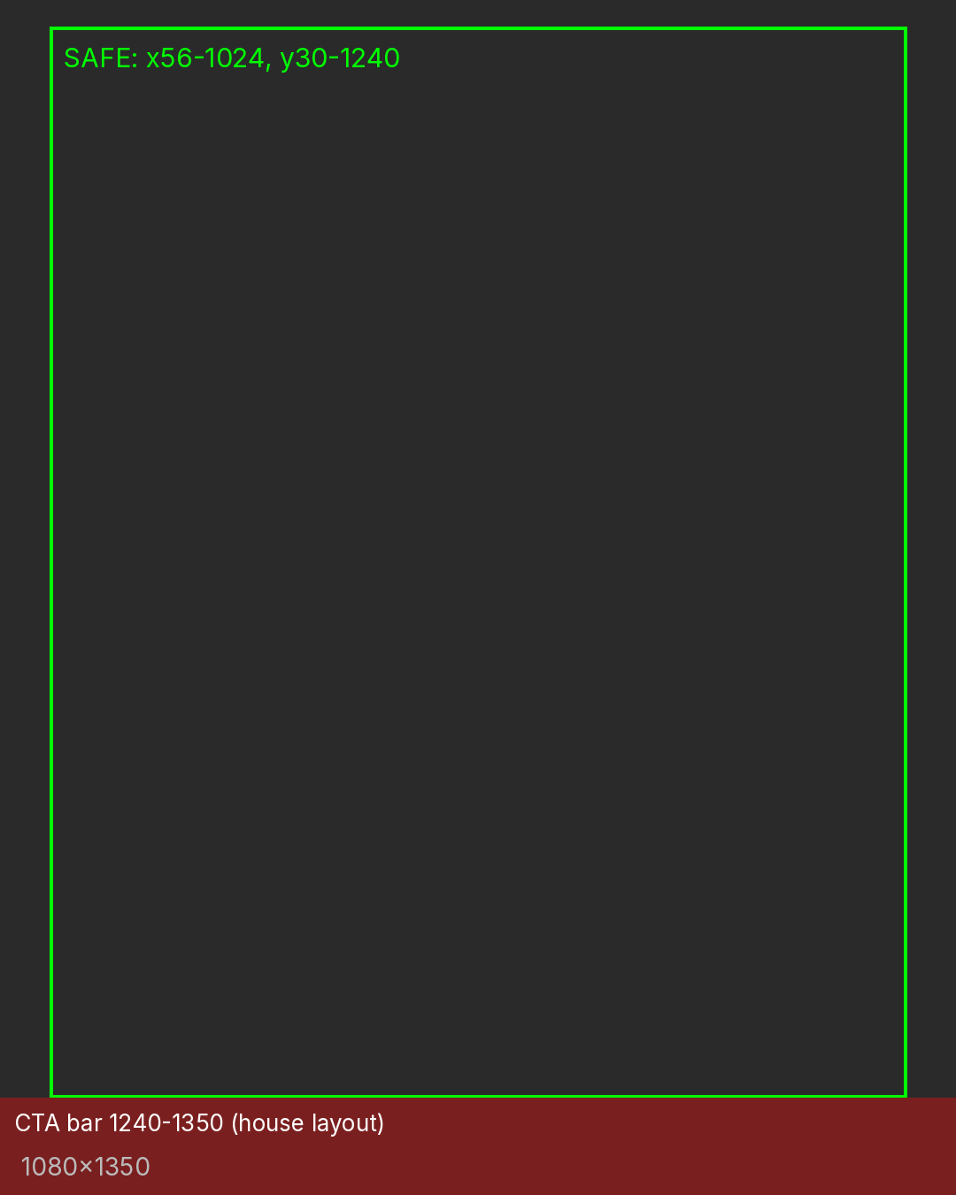
- 4:5 — 1080 × 1350. Default feed image and video format; minimum width 1080px.
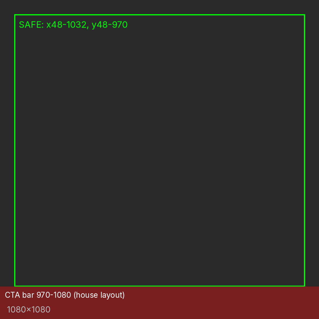
- 1:1 — 1080 × 1080. The safest carousel format. Every card in a carousel uses the same ratio. A 4:5 carousel is an alternative, mainly for Instagram feed.
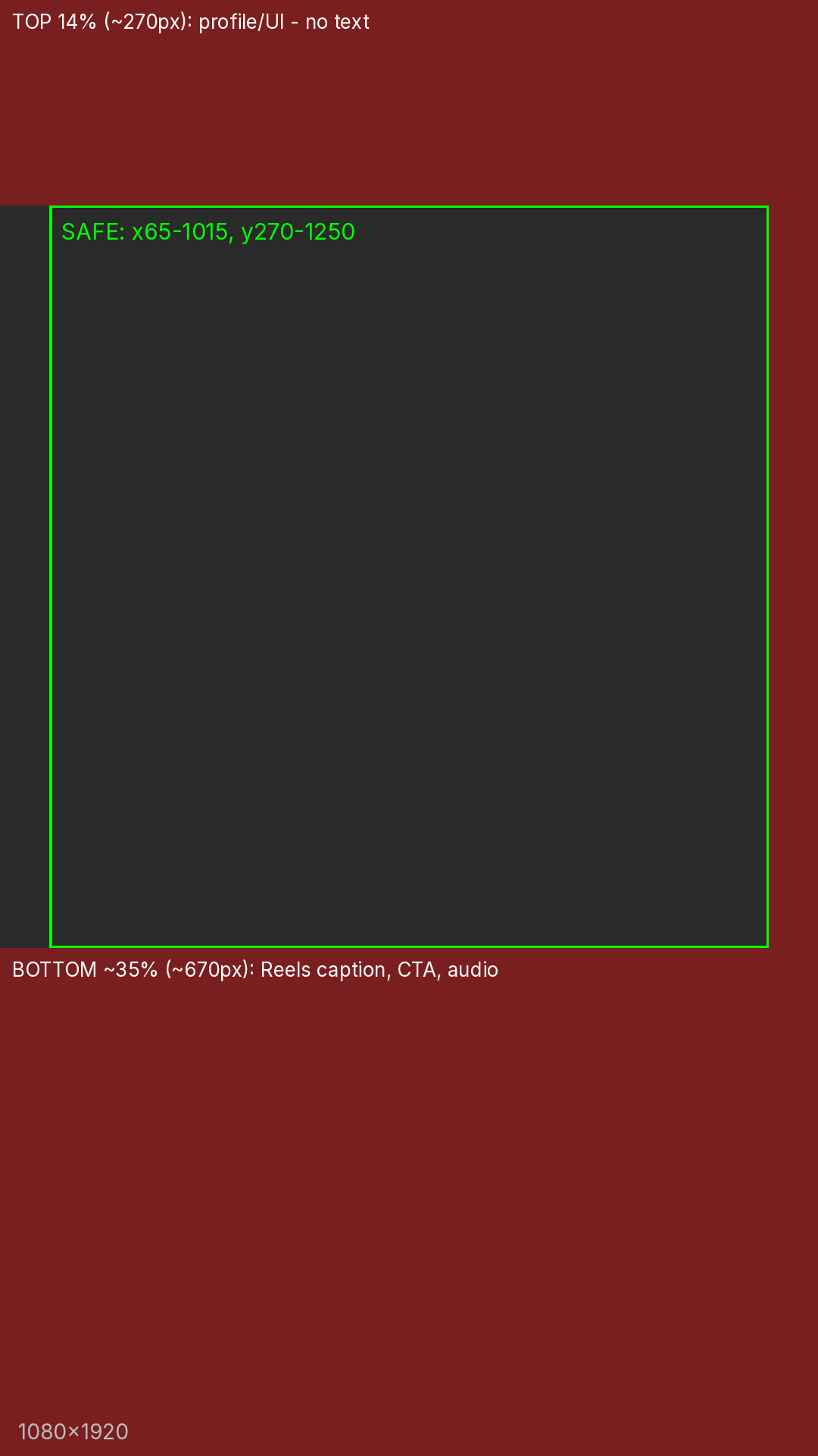
- 9:16 — 1080 × 1920. Native Stories and Reels. 1440 × 2560 is optional. Never stretch a 4:5 composition to fit.
Re-check the Meta Ads Guide before each campaign. These are the supplied production dimensions, not a claim that placement interfaces never change.
The 9:16 safe box
Keep every line of text, badge, price and pill inside x 65–1015 / y 270–1250 on a 1080 × 1920 canvas. Reserve about 270px at the top for profile and progress UI, about 670px at the bottom for Reels controls and captions, and about 65px on each side. Stories can have a smaller bottom obstruction, but the shared template keeps the more conservative box.
House layouts
4:5: top bar y 0–110 for the badge and location or dates; photo window y 110–870; text panel y 870–1240; CTA bar y 1240–1350. Text never sits on the tattoo photo.
1:1: text column x 0–470; photo window x 470–1080 and y 0–970; CTA bar y 970–1080.
9:16: top bar at y 290; all text between y 290 and about 720. A fitted tattoo foreground, 880px tall, starts at y 780 over a blurred copy of the same footage. No CTA bar: Meta supplies the placement's action button.
Never hard-crop the tattoo. Fit the whole piece and fill the sides with a blurred, darkened copy of the same image: approximately 40px blur and 45% brightness. Never upscale source photography. Downscale only, using Lanczos resampling.
03 / Text, captions & motion
Keep text minimal, off the tattoo and inside the safe zone. A headline is no more than three lines, in capitals. Put it in the lower text panel for 4:5 or the upper safe band for 9:16.
Silent-first: every video must make sense without audio. Burn in captions for spoken lines, including artist introductions and testimonials.
Keep the frame chrome still. In the first beat, from 0 to about 2.6 seconds, the hook slides up 120px over 0.25 seconds and reads within the first second. In the second beat, the offer block rises 60px and fades in over 0.3 seconds, then holds. Any offer must be real and current.
Artist-ad grading starts at contrast +12%, saturation −15% and brightness −2%, with a soft vignette and a slow 1.0 → 1.1 push-in. Preserve the actual appearance of the work; do not misrepresent color or detail. A subtle market-palette tint is enough.
Never cover the focal point during the reveal. No blood or raw-skin close-ups. No healing or medical claims. On web adaptations, respect reduced-motion preferences.
04 / Hook patterns
Show the finished work within the first 1.5–2 seconds; a reveal can run 5–8 seconds. These are creative patterns from the supplied guide, not a guarantee of performance.
- POV: “POV: YOU ALMOST BOOKED SOMEONE ELSE.” Use only as an artist-campaign narrative, never as a claim about Tattoo Company booking functionality.
- Tell-me-without-telling-me: “TELL ME YOU GOT A FULL BACK PIECE WITHOUT TELLING ME.”
- Reveal: “WAIT FOR THE REVEAL.”
- Craft: “A BACK PIECE SHOULD READ AS ONE STORY.” Or: “EVERY LEAF PLACED BY HAND.”
- Untested bench: “YOU SAID ‘GO BIG.’ I LISTENED.” Or: “SAVE THIS FOR YOUR CONSULT.” Label tests internally; do not describe them as proven winners.
Write original lines in these shapes. Never mention financing, payment, price or deposits in the hook. Avoid guarantees about satisfaction or outcomes.
05 / Logo on video & ads
Tattoo Company uses the chrome blackletter T monogram with its four-point sparkle. The lockup pairs it with Tattoo Company in Inter Tight Bold, #F0F0F0 on #050505. “Tattoo Co” is only a compact alternative.
Keep at least half the monogram's width clear on every side, with a 16px minimum clearance. Minimum mark size is 24px. Use a solid #050505 field or a sufficiently dark, quiet area inside the safe box. Never place the mark on busy tattoo photography, in the top 270px, or in the bottom approximately 670px of a 9:16 frame.
Do not stretch, recolor, outline, add shadows or glows, or animate the mark's shape. A simple fade or slide is enough.
Artist campaigns: the artist is the brand. Their name belongs in the signature layer. Tattoo Company marks appear only in explicitly co-branded campaigns. Do not add the Tattoo.agency mark by default.
06 / Color
Tattoo Company creative
Keep the frame monochrome. Color comes from the tattoo photography.
- Background: #050505.
- Surface: #0D0D0D.
- Accent surfaces and cards: #1E1E1E.
- Muted text: #888888; verify contrast at the actual size and background.
- Secondary text: #E2E2E2.
- Foreground: #F0F0F0.
- Primary button: #FFFFFF, with #050505 text.
Do not use the older zinc palette or system fonts.
Artist campaigns: Plum / Orchid
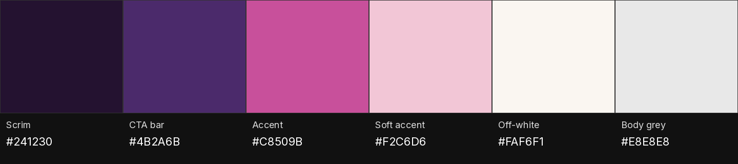
Use #241230 for dark fields and scrims, #4B2A6B for the CTA bar, #C8509B as the accent, and #F2C6D6 as the soft signature accent. Badges use the soft accent with dark text. A CTA gradient may run from #4B2A6B to #C8509B with off-white text, subject to contrast testing.
Artist campaigns: Charcoal / Soft Gold
Use #1C2126 for dark fields, #333F48 for the CTA bar, #B9975B as the accent, and #E7B7B5 as the soft signature accent. Badges use the accent with #1C2126 text. A CTA gradient may run from #A0804A to #D6B880 with #1C2126 text. Offer headlines use #D6B880.
Both palettes use #FAF6F1 off-white and #E8E8E8 body text. A three-color rule beneath the badge may use the local palette. Keep local references recognizable but muted. No loud neon or rainbow gradients. Do not use loud yellow.
07 / Typography
Artist campaigns
- Headline: Archivo Black, capitals, −3% tracking. At 1080px width, start at 78–92px, or 58–72px for a tight layout. The supplied headline size/leading example is 78/73px; adjust for legibility rather than clipping letters.
- Signature: Bodoni Moda Medium, 50–64px, −3% tracking, in the soft-accent color.
- Labels and CTA: Inter ExtraBold–Black, 22–24px, capitals, +5% tracking.
- Badges: Inter Regular, 22px, capitals, +12% tracking.
- Body: Inter Semibold, 29–31px, #E8E8E8.
Use no more than two type families plus the Bodoni signature layer. Tattoo Company ads use Inter Tight, including bold headlines. Check legibility at the final placement size.
08 / Payment & financing
Contact hello@tattoo.co before running payment-related creative.
Do not make promises about deposits, payouts, booking protection, no-show protection or payment readiness in Tattoo Company creative. Do not say “get booked,” “get paid,” “get paid faster,” “book now and pay” or “secure your spot with a deposit.” Use join Tattoo Company for artist-facing calls to action.
Never place financing in a hook or headline. No lender names, logos, APR or terms in ads.
09 / Claims & disclosures
No invented numbers. Member counts, revenue, bookings, return on ad spend, reviews and percentage improvements need a real, verifiable source on file.
If a mockup or B-roll uses sample records, display Example visibly. Prefer to omit sample financial or performance numbers from paid ads rather than risk presenting them as proof.
Prices and offers must be current, real and show their end date. Testimonials need real clients, written consent and faithful editing. Do not change their meaning.
Put affiliate disclosures immediately beside the link in plain language, such as: “Affiliate link: I earn a commission if you sign up, at no extra cost to you.”
Tag links consistently with UTMs: source identifies the channel, medium identifies video or paid social, and campaign identifies the specific campaign. Do not put client personal information in tracking parameters.
10 / Do & don't
Do
- Show the finished piece early and keep the whole work visible.
- Keep text and logos inside the safe box.
- Use muted market palettes.
- Caption spoken content and check the silent experience.
- Label examples, substantiate claims and keep consent on file.
- Say “tattoo artist” and “Tattoo Company.”
- Contact hello@tattoo.co before running payment-related creative.
Don't
- Hard-crop, upscale or distort the tattoo.
- Put text behind platform controls or over the piece's focal point.
- Use loud yellow, neon or unrelated gradients.
- Invent statistics, earnings, urgency or testimonials.
- Show blood, raw skin or medical claims.
- Add lender names, logos or financing messages because an old template includes them.
- Imply product capabilities that are not available.
11 / Downloads & starting points
Use the brand-specific kits for logo, token and font-reference files. Check safe-zone and house-layout templates against the dimensions above before use.
Supplied assets
Download the Tattoo Company ads kit. The rules in this guide take precedence over older examples in the archive.
Layout templates
- 9:16 safe-zone template — 1080 × 1920 PNG.
- 4:5 house layout — 1080 × 1350 PNG.
- 1:1 carousel layout — 1080 × 1080 PNG.
Palette swatches
- Tattoo Company palette PNG.
- Tattoo.agency palette PNG.
- Plum / Orchid artist-ad palette PNG.
- Charcoal / Soft Gold artist-ad palette PNG.



The supplied Canva starting points are links only:
Both contain client-specific material. Duplicate the original and strip client names, images, claims and identifying details before reuse. Do not edit the originals or publish their contents without permission.
Font references: Archivo Black, Bodoni Moda, Inter and Inter Tight.
Before publishing: verify current Meta placement specifications and check every claim and asset. Brand questions: hello@tattoo.co.